


Contact Info
106 Anne Rd, Knoxfield VIC 3180, Australia
+61 (03) 82023009
info@ninjaweb.com.au
Contact usRecommended Services


Supported Scripts
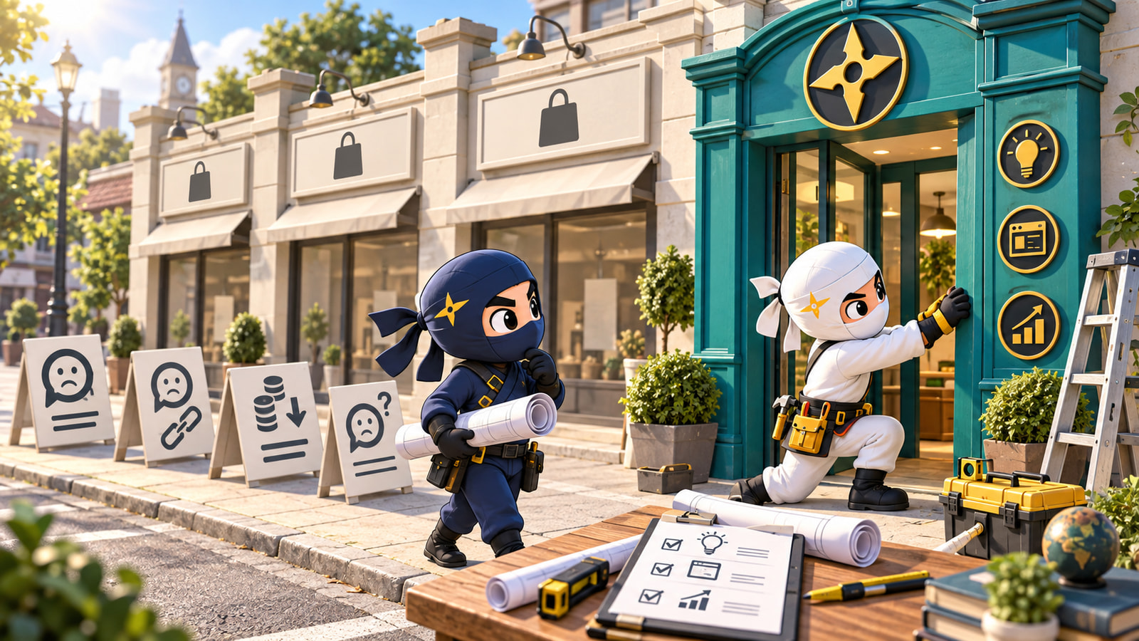

You send the designer a competitor’s website. Clean layout. Strong photographs. A quote button exactly where you would expect it. “Make ours like that,” you say. It feels like a useful starting point because everyone can see what you mean.
Everyone can see what you like. That is a different thing.
A website brief has to explain what a buyer needs to understand, what you can credibly promise and why choosing your business makes sense. A screenshot answers none of those questions. If it becomes the whole brief, you are paying someone to make your uncertainty look like somebody else’s confidence.
What the screenshot leaves out
You can see the competitor’s homepage. You cannot see the conversations that bring customers to it, the referrals that have already established trust or the sales team correcting its omissions afterwards. Perhaps that website wins enquiries. Perhaps it survives on a reputation built elsewhere. Appearance alone cannot tell you.
Copying it quietly turns those unknowns into assumptions. Their prominent price calculator must be useful. Their short service descriptions must be enough. Their photography must be what convinces people. Soon your brief contains a list of borrowed features with no explanation of the job each feature should do for your customers.
That is expensive even when the build is cheap. Somebody still has to choose what goes on the page. Without evidence, those decisions become rounds of preference: a bigger photograph, another animation, a different shade of blue. The business question underneath remains unanswered.
The designer should challenge this. So should the business owner. Neither gets to outsource the question “Why would someone choose us?” to a competitor’s navigation menu.
Borrow the convention, question the promise
There is a fair objection here: familiar websites are easier to use. A customer should not have to solve a puzzle to find your phone number. An online shop needs recognisable product information and a checkout people understand. Inventing a strange interface simply to look original can make the site worse.
Keep the useful conventions. Borrow the clarity of a readable service menu, the restraint of a short form or the convenience of showing delivery information before checkout. Describe why each reference works. “I can see which service fits me without calling” is a much better instruction than “Copy this section.”
The line is between a familiar way to find information and a borrowed reason to buy. Your competitor’s warranty, delivery model, specialist experience and service limits belong to their business. Dressing those claims in your colours does not make them true for yours.
The same reference, two very different briefs
Take a hypothetical commercial maintenance company. It wants enquiries from property managers, and its owner sends the designer a polished competitor website. This is an illustration, not a NinjaWeb client case study.
“Use this sort of premium look. We want a large hero image, a list of services and a request-a-quote form. Make us look established.”
There is enough there to start drawing rectangles. There is very little to help decide what belongs inside them. “Premium” might mean expensive photography to the owner and dependable communication to the property manager.
Now imagine the same company writes this instead:
“We want property managers responsible for several commercial premises to enquire about planned maintenance. Before contacting us, they need to know our service area, which jobs we handle directly and how we report completed work. Show an authorised sample of our completion report. Make the enquiry collect the site location, job type and access constraints. Do not imply we offer emergency attendance unless we can actually support it.”
The second brief gives the designer choices to make. The report sample becomes evidence. The service area prevents wasted enquiries. The form reflects the information needed to respond. Photography can show relevant work instead of merely filling a banner.
It also exposes missing inputs before design begins. If the company has no publishable report sample, somebody must prepare or obtain one. If the service boundaries are disputed internally, the owner must settle them. A copied layout would hide both gaps until much later.
Give the designer something to decide with
You do not need a fifty-page strategy document. You need enough honest material to make the important page decisions. Start with the customer conversations you already have: what people ask before buying, what stops a suitable enquiry and what creates an unsuitable one.
- Name the buyer and situation. “A property manager comparing maintenance providers” is usable. “Anyone who needs our services” leaves every decision open.
- State the uncertainty. Is the buyer unsure about coverage, compatibility, the process, the price structure or whether you handle their type of job?
- Bring evidence you have permission to use. Relevant work photographs, a sample deliverable, accurate specifications or a clearly explained process beat an unsupported claim to be the best.
- Set the boundaries. Say which locations, requests and customer situations you cannot serve. Hiding those limits does not make the business more capable.
- Define the next step. Specify what a useful enquiry contains and what happens after somebody sends it.
Where those answers reveal a confused offer or an interchangeable identity, Identity and Branding is the work to do before polishing the homepage. A visual identity should express a position the business can support. It cannot manufacture the position by itself.
Once that decision is clear, WordPress development can turn the brief into useful page structure, enquiry forms and content your team can maintain. The platform matters at implementation. It does not answer the commercial question for you.
A reference belongs in the margin
Keep the inspiration links. Annotate them. Point to the readable typography, the clear comparison or the way a complicated service is explained. References help a designer understand your taste and can save a long, vague discussion.
But put your own business in the centre of the brief. Write down who the page must persuade, what is making that person hesitate and what you can show to resolve it. If you cannot fill those three lines, the next task is a conversation about the business.
Another screenshot will not finish that conversation.